B2B SaaS
Redesigning Operations & Logs for a B2B Integration Platform
Technical users needed to detect and debug integration failures fast across an iPaaS / workflow automation platform. I split the experience into two connected flows, one for scanning speed and one for debugging depth, using progressive disclosure across both.
2 months (this case) · 2 yrs ongoing
Internal & client-side integration developers
End-to-end Product Designer
Challenge
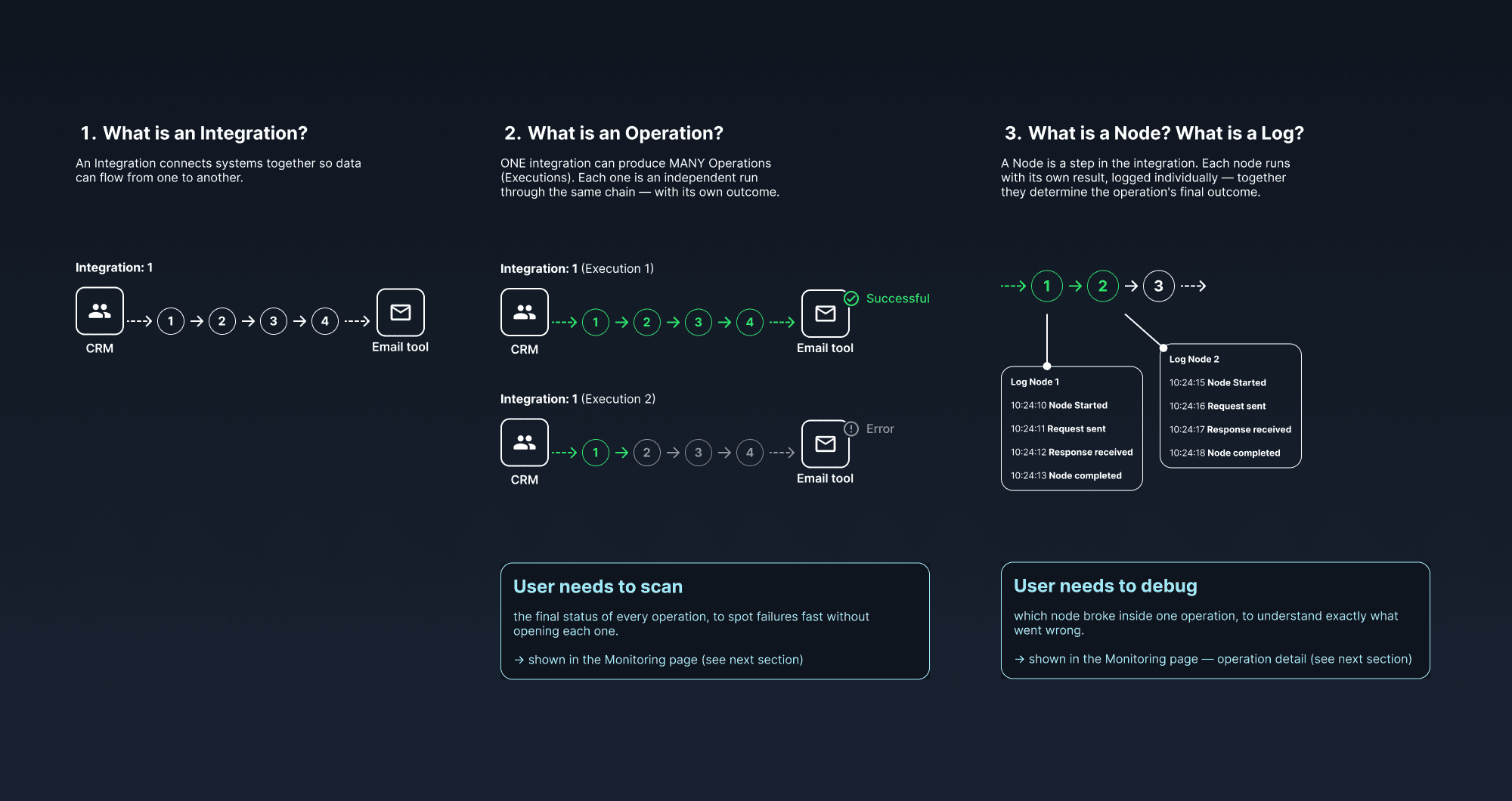
FlexiPaaS is a SaaS integration platform (an iPaaS / workflow automation tool, in the same category as Zapier, Make, or n8n) where users connect systems by building node-based workflows. Through user interviews, we found friction in two connected places: the Operations panel, where users scan and debug at a glance, and the Operation Detail page, where they trace how data actually moves through a workflow. Monitoring and debugging are core to any integration platform. The faster issues get resolved, the more reliably integrations support the business processes depending on them.
The people using this system are developers: some internal to Open Dev Pro, building integrations for external client companies; others belong to those client companies themselves, monitoring integrations they built on the platform. The stakes are real: an integration that updates shipment status for a logistics company, for example, can stall an entire business process in production if a failure goes undetected.
On the Operations panel: statuses were hard to scan, some status names looked nearly identical, and the underlying meaning was genuinely confusing, largely because status labels mirrored internal backend processes directly, technical detail that never needed to reach the interface at all. That confusion had a likely cause: implementing statuses to mirror backend processes was probably faster to ship than defining a frontend-specific taxonomy from the start, and design never got the chance to revisit it once live.
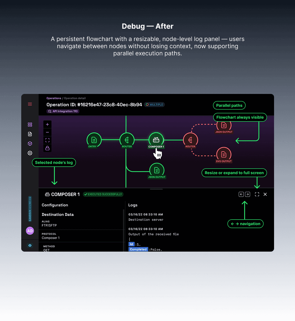
On the Operation Detail page: every node looked the same, making errors hard to spot. Users had to jump between separate views to see node details, losing context each time. And the layout couldn’t support more complex, branched workflows.
Results
On the Operations panel, users reported being able to detect operations needing attention (errors and retryables) at a glance. The new structure also reduced the time junior developers needed to understand how operations worked.
On the Operation Detail page, users reported spending less time debugging and felt more confident using the system.
Neither result is backed by a usage dashboard. Metrics were never implemented at FlexiPaaS. What’s real is direct, consistent feedback from the platform’s daily users, and a solution that came from actual analysis rather than assumption: understanding the backend before touching the frontend avoided real engineering cost.
2 months
Timeline
5 users
Usability testing


Process
Research: I talked directly with backend developers to understand where each status actually came from and what it meant, then investigated what users expected to see on the panel. This reflects the same kind of stakeholder management and cross-functional collaboration that shaped every decision on this enterprise-grade platform. I used Claude to benchmark competitor patterns (Zapier, Make, n8n), map out the operation states systematically, and think through edge cases before committing to a direction. What I initially assumed might require backend rework turned out to be solvable entirely in the frontend, once the underlying logic was clear: a lighter fix than the one I’d expected going in.
Operations Panel: Decisions
· Merged 6 statuses down to 4 (Error, Success, Retryable, In Progress), removing the backend-specific noise
· Added badges with icons and semantic color per status for at-a-glance scanning
· Reinforced the “In Progress” status with an animated icon
· Reorganized the table to highlight the information users actually needed first
· Created a new “Multiple” status to support branched workflows
· Added search and filtering, a need surfaced through heuristic analysis and usage patterns, once it became clear users often needed to find one specific operation, not just scan the full list
Operation Detail Page: Decisions
· Replaced view-switching with a bottom sheet: clicking a node reveals its logs without leaving the page or losing context
· Added a full-screen option for deeper exploration when needed
· Applied semantic colors so errors are visible at a glance across nodes
· Redesigned the layout to show nodes and logs together, supporting branched workflows
Both changes shipped progressively rather than all at once, to avoid overloading the development team or extending delivery time.
Next step already identified: going one level deeper into log granularity, from Operation to Operation Log to individual Node Log, for even more precision when debugging.

Conclusion
Beyond this redesign, information architecture and navigation were a constant thread throughout my two years on FlexiPaaS: designing 10+ end-to-end configuration flows from ambiguous briefs, and going deep into the platform’s technical logic to keep pace with how the system actually worked, not just how it looked.
Kuala Lumpur, APAC